MoonBeam Cafe

• brand strategy
• visual identity
• brand guidelines

My workFLOW

Foundation

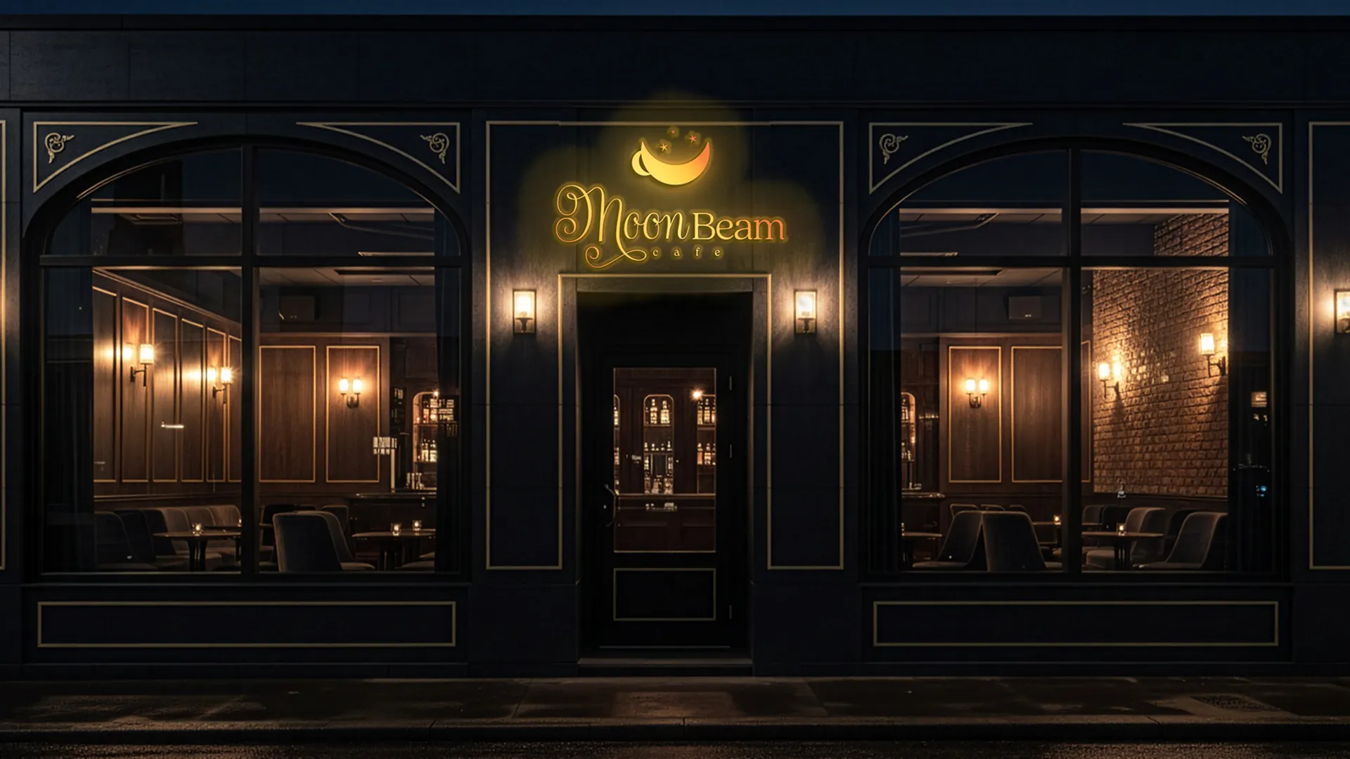
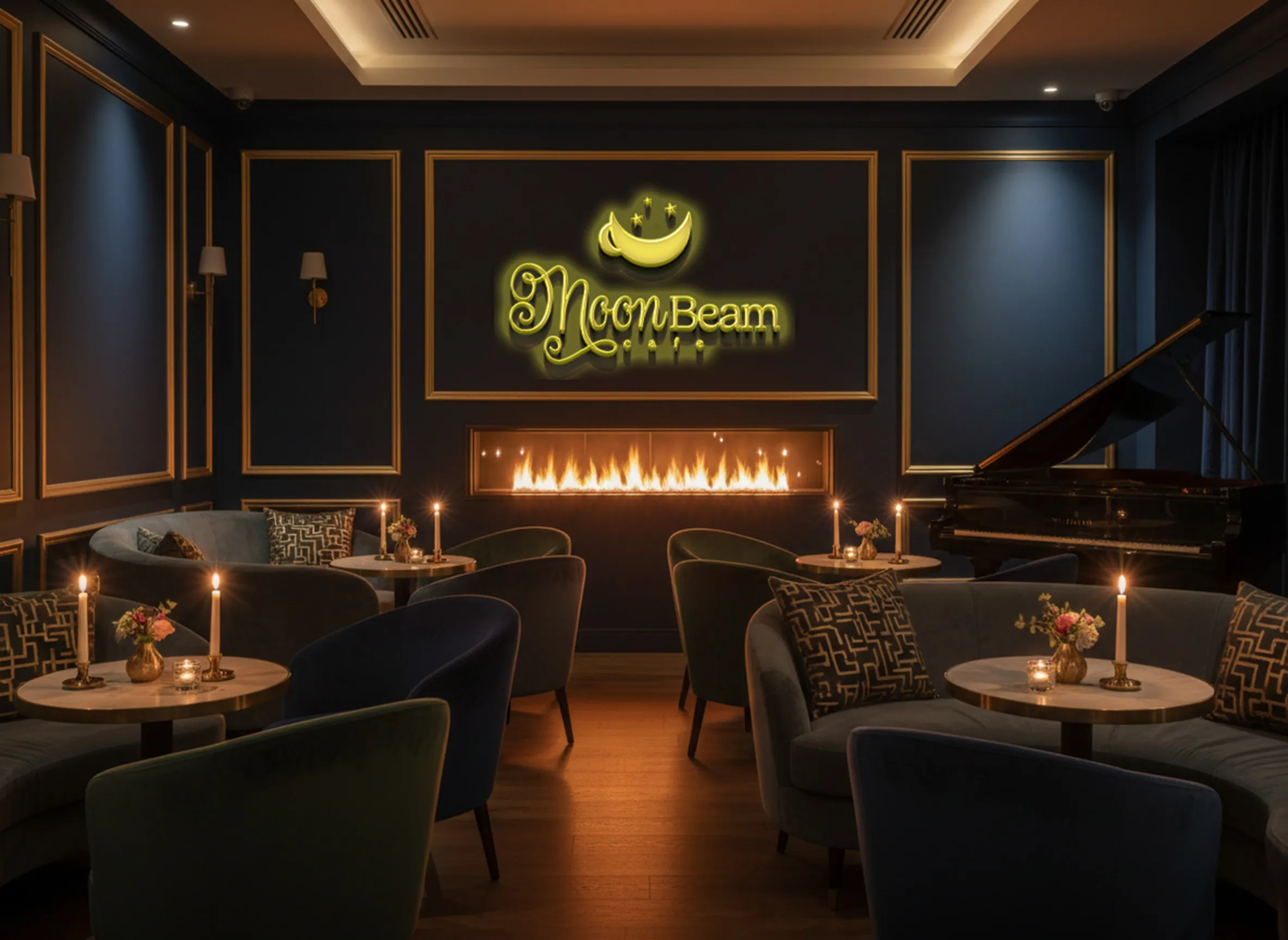
Moon Beam Café is a space that exists between the demands of the day and the quiet of the night. It is not a place of urgency, but of transition, where work softens into conversation, and routine gives way to presence.
The foundation is rooted in connection, atmosphere, and craft. Every detail is intentional, designed to slow the pace and create room for meaningful interaction. It serves professionals, creatives, and thinkers who value depth over distraction.

Look

The visual direction for Moon Beam Café explores the duality between day and night, movement and stillness, productivity and pause. Inspiration is drawn from moonlit streets, jazz lounges, vintage cafés, and the quiet elegance of evening rituals.

Outcome

The visual identity reflects the calm sophistication of the evening.
A deep navy palette grounds the brand in the stillness of night, while warm gold tones introduce softness and glow. Typography balances elegance and clarity, script elements echoing fluidity and jazz, while serif and sans-serif structures maintain refinement and readability.

World

Moon Beam Café extends far beyond its physical location. It exists in every interaction, creating a consistent experience that feels calm, thoughtful, and welcoming.

Every touchpoint reinforces the same promise: to offer a gentle transition from the demands of the day into moments of connection, reflection, and presence.

Moonlight

HEX           #FAF2DA
RGB            250, 242, 218
CMYK        2, 3, 15, 0

Luxury Gold

HEX            #fbcd36
hex            #ffeeb5
hex            #c2922e

Midnight blue

HEX            #171E3E
RGB            23, 30, 62
CMYK        95, 88, 44, 51

Cappuccino

HEX            #BD9161
RGB            189, 145, 97
CMYK        25, 43, 69, 3