Dark Alchemy Coffee
Project Summary
Platform
Square Online
Previous Platform
Wix
Timeline
Approximately one week
Scope
Website strategy, redesign, ordering experience, and implementation
Branding
Existing client identity
The Disconnect
Dark Alchemy Coffee already had a distinct atmosphere, an established visual identity, and a real community around the café. But its Wix website told a different story.
The site relied on generic template content, unrelated stock imagery, placeholder copy, and navigation that was clipped on desktop. The menu and ordering experience also felt disconnected from the personality of the café.
The problem wasn't the business or its brand. The website simply wasn't communicating what was already there.
The Strategy
The goal was not to reinvent Dark Alchemy. It was to translate the existing brand into a clearer and more useful digital experience.
The website needed to foreground the café's craft, atmosphere, personality, and community while giving customers a direct path from discovering the business to exploring the menu and placing an order.
01
Feel like the actual café
02
Make ordering easier to understand
03
Give the owner a website she could manage
The Redesign
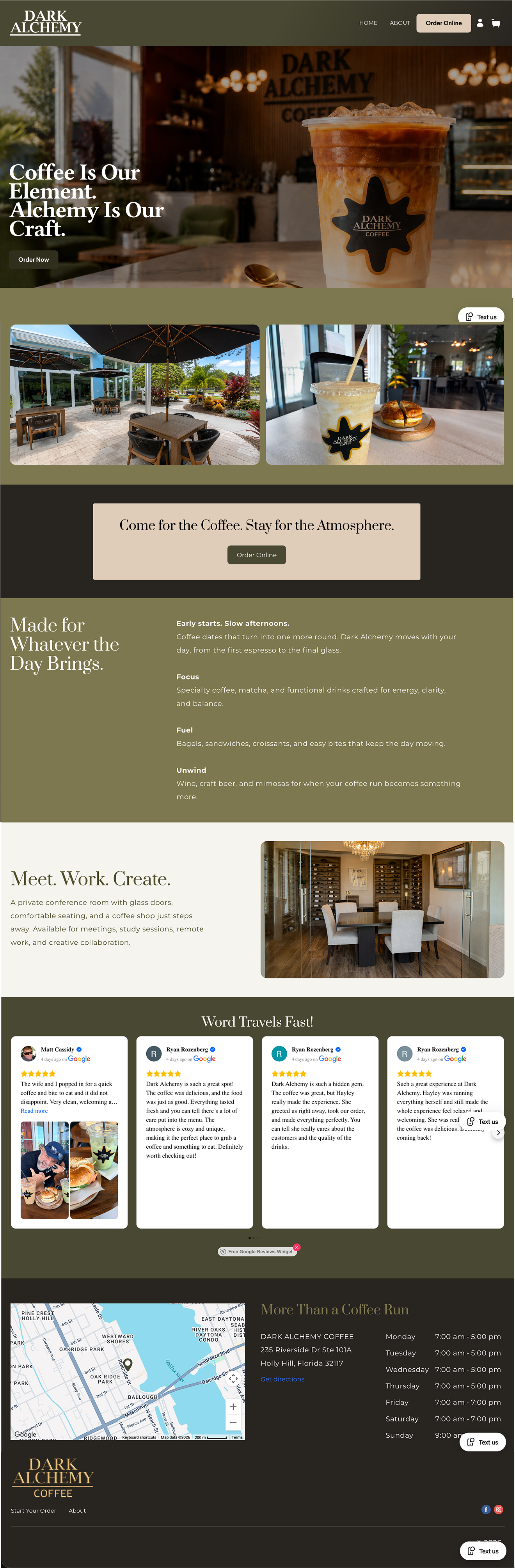
The website was rebuilt inside Square Online so the brand experience and ordering system could work together.
The new structure created clearer paths through the homepage, menu, About content, contact information, and online ordering. Existing brand assets and approved photography replaced generic template content, while menu categories, product details, pricing, and available options were organized into a more understandable customer journey.
Information architecture
Created clearer paths through the homepage, menu, About content, contact information, and ordering.
Existing-brand implementation
Replaced generic template content with the café's actual identity, photography, atmosphere, and story.
Square ordering experience
Organized menu categories, product details, pricing, options, and add-to-order behavior.
Responsive experience
Optimized the site for customers browsing and ordering across desktop and mobile.
Owner handoff
Built the site inside Square Online so routine content and menu updates could be managed without a developer.
Before & After
Homepage
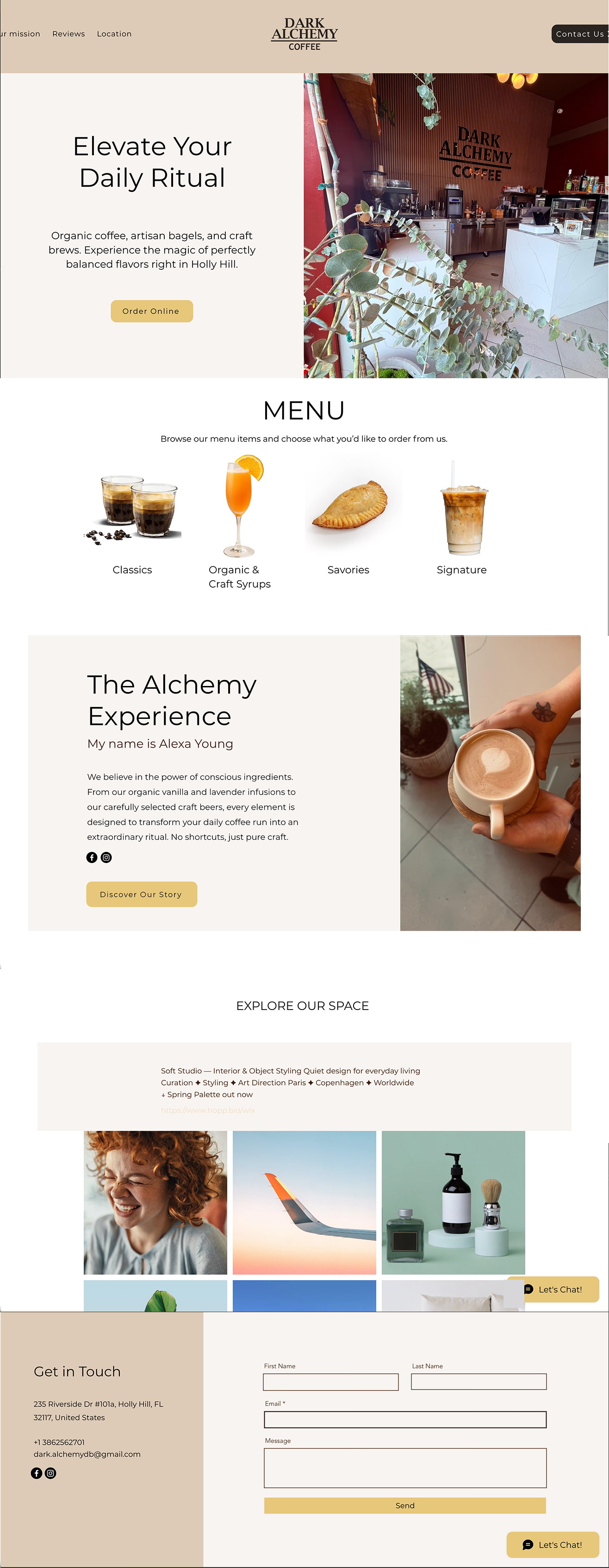
Before — Existing Wix Website
After — Dark Alchemy on Square Online
About
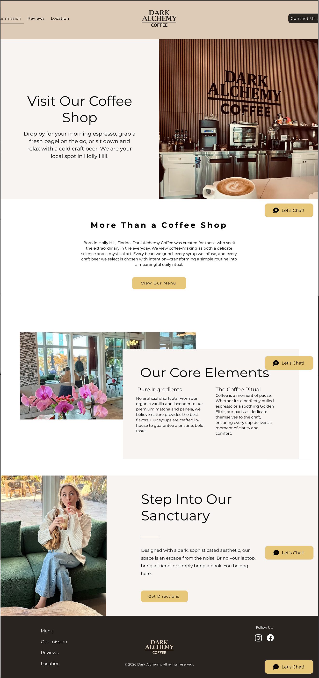
Before — Existing Wix Website

After — Dark Alchemy on Square Online
Ordering
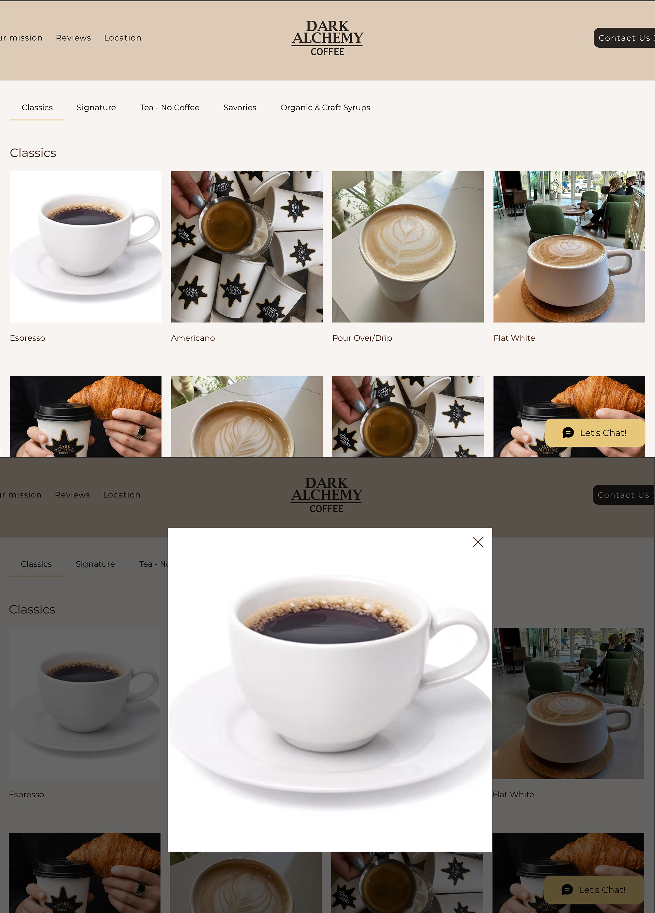
Before — Existing Wix Website
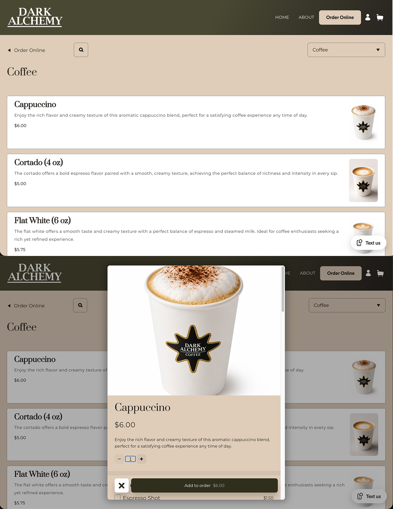
After — Dark Alchemy on Square Online
Menu & Ordering Categories
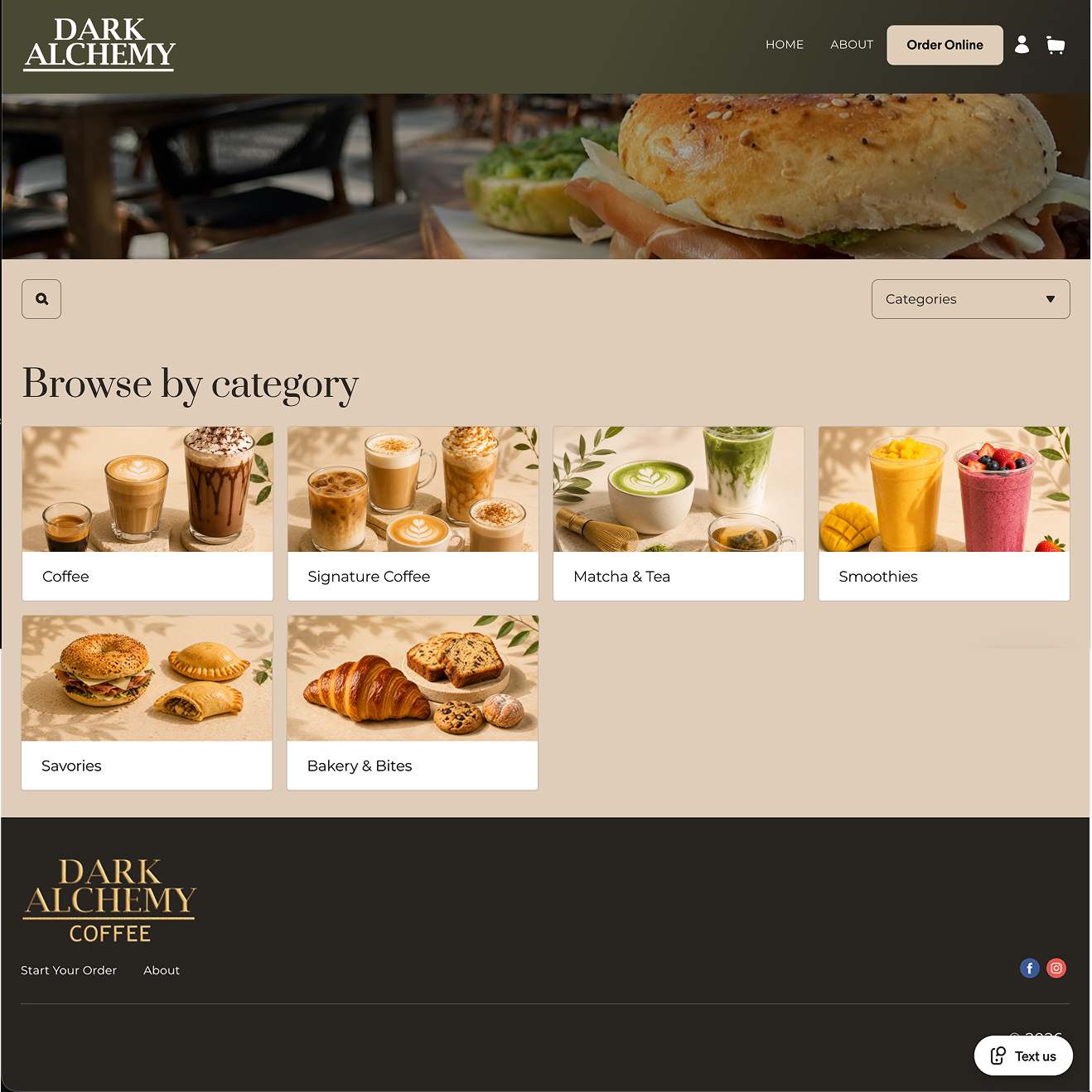
After — Menu & Ordering
The Outcome
Dark Alchemy moved from a generic, disconnected Wix experience to a Square Online website built around the real character and daily needs of the café.
The result is a more cohesive digital presence, a clearer ordering journey for customers, and a website the owner can update without depending on a developer for everyday changes.
If the business has evolved but the website still reflects an earlier version of it, the problem may not be the business. It may be how the value is being communicated.