Posh Paws believes pet care should feel as nurturing and intentional as caring for any family member. The brand is rooted in the idea that grooming is more than a service, it's an act of wellness, comfort, and love.
Look
The visual direction for Posh Paws draws inspiration from quiet luxury, boutique hospitality, and the warmth of everyday companionship. The creative exploration balances sophistication with softness, taking cues from elegant interiors, premium self-care experiences, delicate textures, and the gentle moments shared between people and their pets.
Outcome
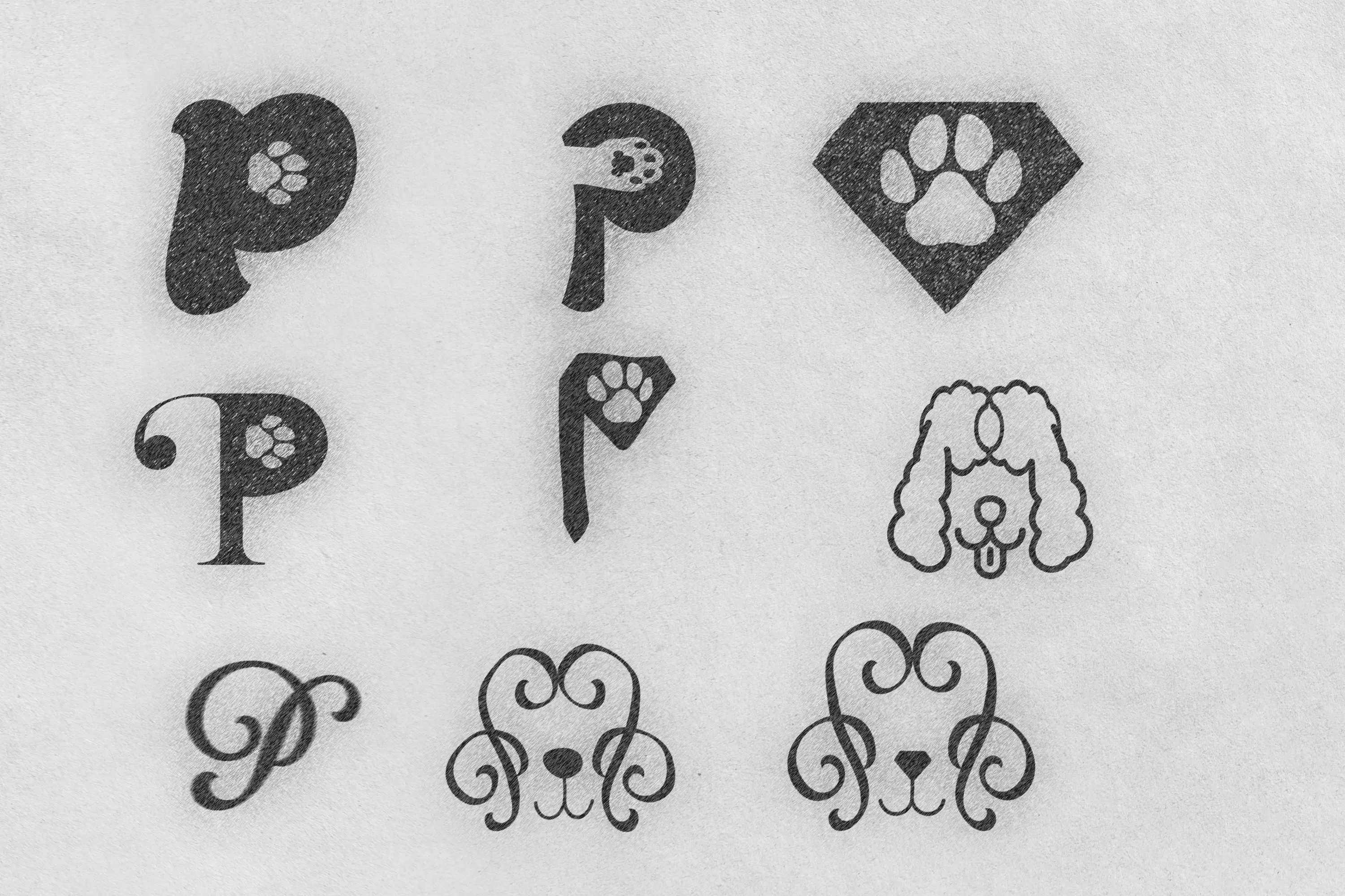
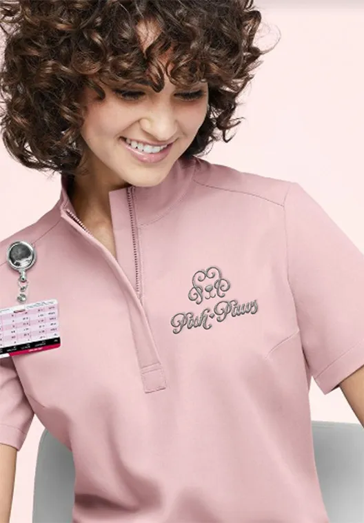
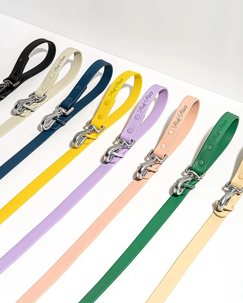
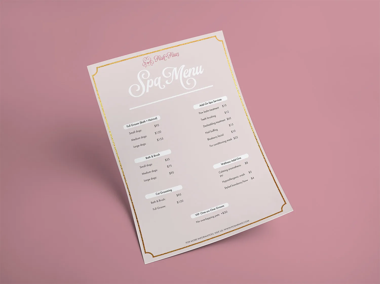
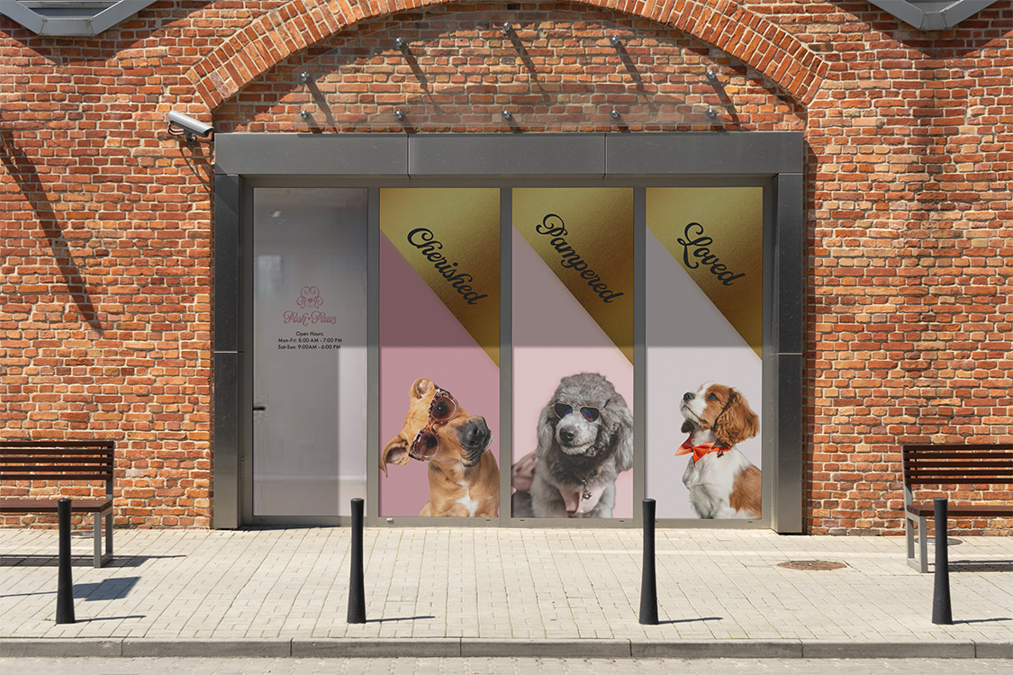
The visual identity of Posh Paws embodies a sense of modern luxury that feels warm, nurturing, and effortlessly elegant. Ornamental typography introduces character and refinement, creating a signature look that feels timeless and thoughtfully curated. Soft blush pinks bring comfort, gentleness, and femininity, while touches of gold add sophistication and a sense of elevated care.
World
Posh Paws lives beyond the grooming appointment. It exists in every interaction, creating an experience that feels comforting, trustworthy, and thoughtfully curated. Every touchpoint reinforces the same promise: that exceptional grooming is not simply about how pets look when they leave, but how cared for, comfortable, and loved they feel throughout the entire experience.